Project Overview
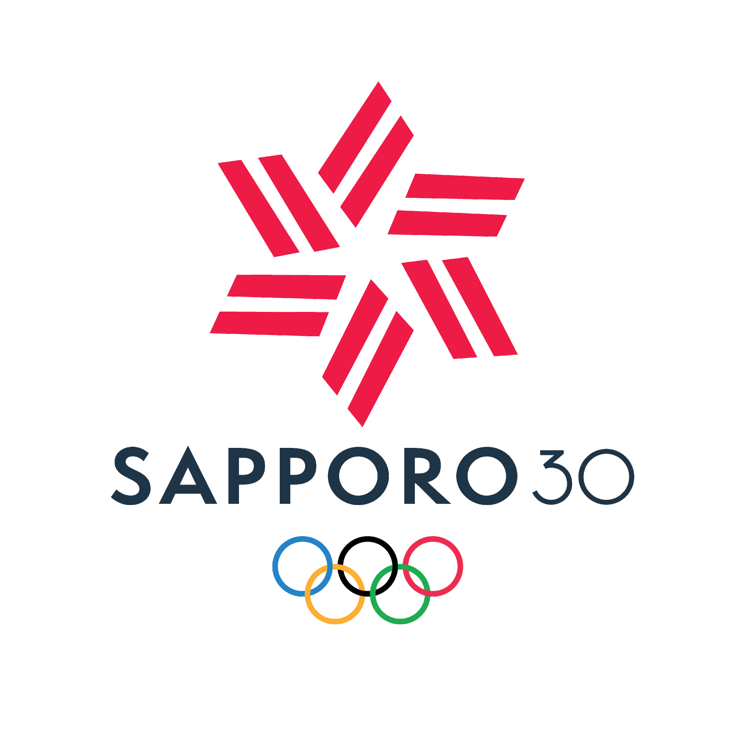
This Olympics branding project was a semester-long assignment. The assignment focused on research and process in designing a branding system for a future Olympic Games. I developed an entire branding kit which included a logo, posters, color, iconography, tickets, banners and social media ads promoting the games.
Sapporo Olympics
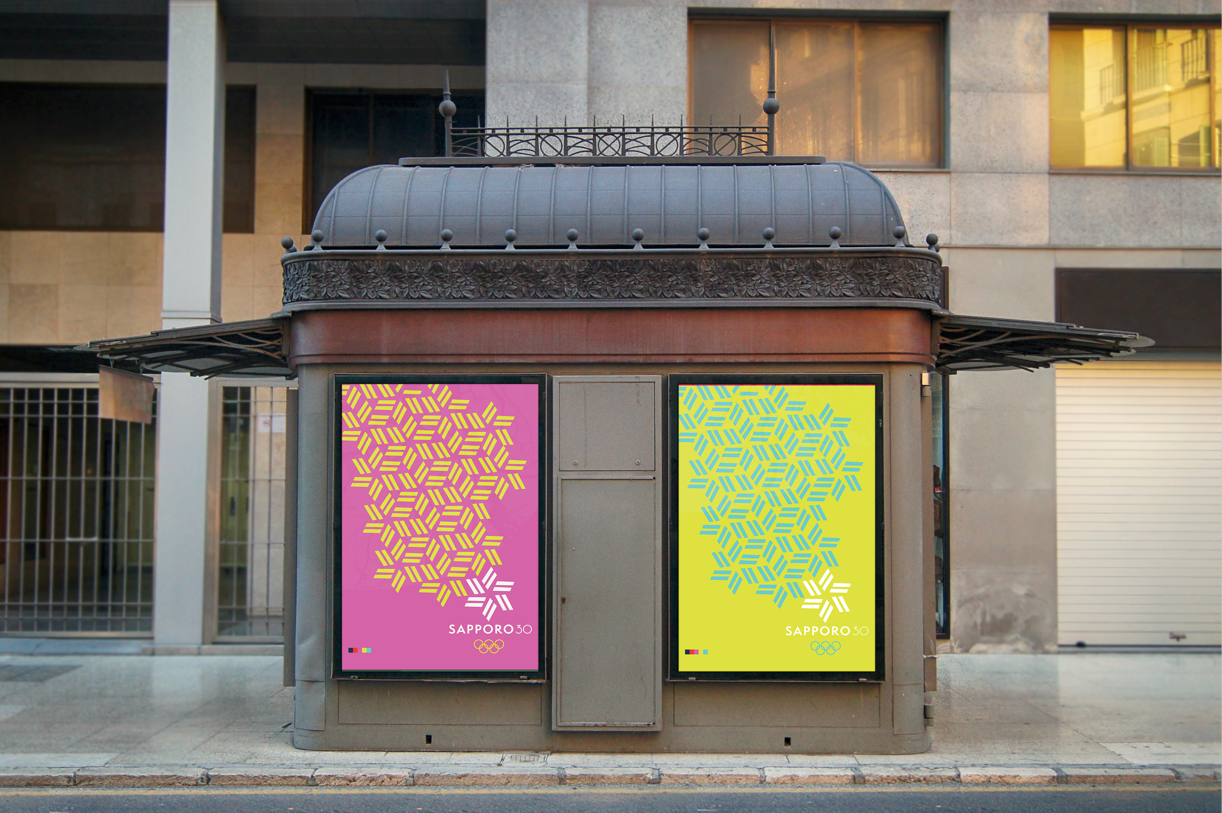
Color Palette & Poster
I whipped up a color palette with a poster series in mind. I was interested in using bold, cool contrasting colors to create "slant-rhyming" pop-art posters with interesting compositions. I landed on a falling-snow effect using my repeating logo mark, guiding the eye down to the mark at the bottom, which stands out against the others and anchors to the text. The color palette for this entire branding concept was designed to serve this type of style.


Research
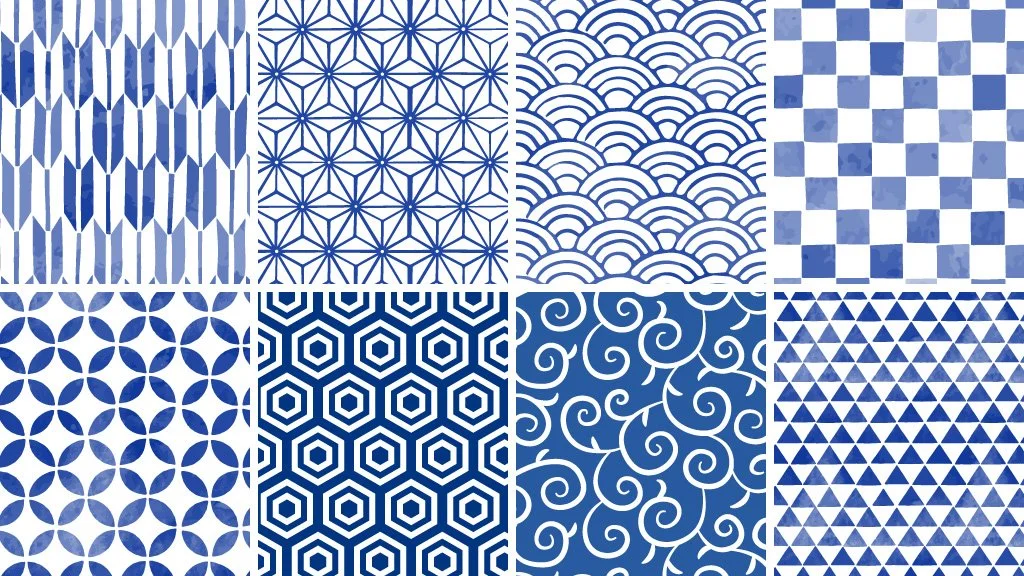
For my research, I was interested in traditional Japanese patterns used in fabric and weaving. Each pattern has unique symbolism and meaning. As I scanned through at the patterns and their figurations, I realized that the Kagome pattern, a basket weave, resembled a snowflake. That was my launching point. I liked how the pieces nestled in and fit together; it's like how each country in the Olympic Games comes together for such a special and historic event. The Kagome pattern symbolizes protection from demons, so the technical symbolism kinda misses the mark for the Olympic Games, but I think it could be spun to represent unity and strength, since a basket weave is strong.
Typeface
The primary typeface I used for this project is Semplictica, a simple, geometric typeface. I shot for a very clean, even futuristic looking font which is really elegant in all caps. I did a brief research on the city of Sapporo and learned that it is is a modern and sleek city, so I selected a typeface to match. Another thing I paid attention to when choosing a face was the letter shapes because I wanted the letterforms to have sharper points in order to feel alpine and wintery to speak to the winter games. The typeface Semplictica was able to deliver that in the letter "A" for example, subtly echoing a mountain.
Pictograms
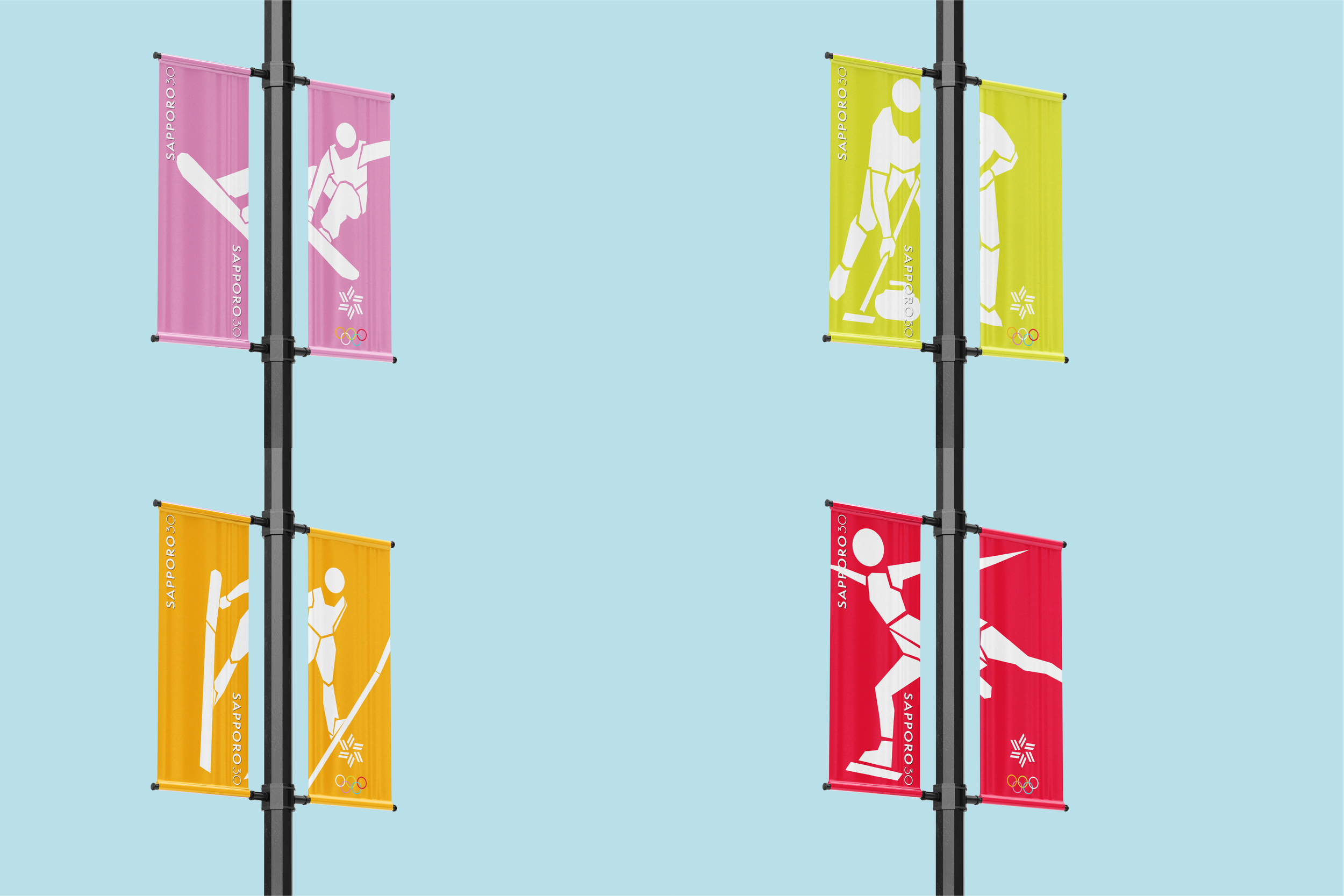
I designed my pictograms to be fragmented so they would fit together, mirroring my poster concept. The figures are broken up and backed by a triangle base, a shape which can actually be found hidden within the snowflake array of my poster.
Tickets & Banners
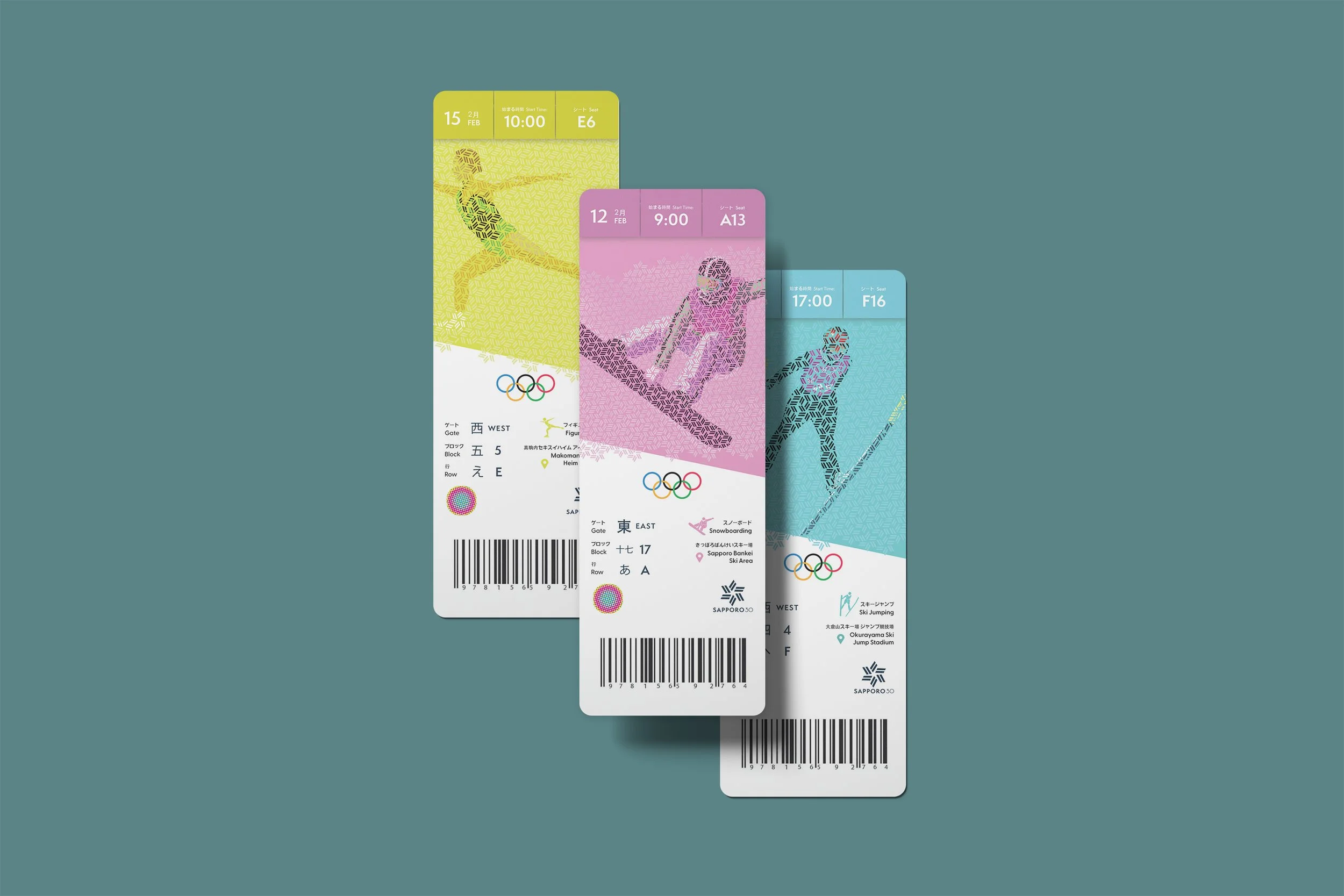
The tickets were designed using my snowflake logo motif fit together, only on a very small scale in order to reveal an image of an athlete.
Social Media
Medal Design
Sapporo is a city on the Japanese Island Hokkaido. My simple medal design draws from the island’s flag.
Mascots
Ermines are adorable little mountain-dwelling weasels. They can be found throughout the northern globe, including the Japanese island of Hokkaido where they adapt to the cold winter climate by turning their fur white to blend into snow.
The Sapporo 2030 mascots are Meiyo meaning honor in Japanese, and Katsu meaning victory. Katsu is a very talented weasel! She can play any sport and has all the equipment for each event - lots of wardrobe changes with this one. Meiyo is a bit more shy and doesn’t really know what’s going on most of the time. Together, they make quite the dynamic duo.
January-May 2023

